We have 3 numbers in fairly short order: JOLTS, first time claims, and the monthly jobs number. What do we have so far? The first time claims continue to come in well below ‘recession’ levels. From that number, the labor market looks tight. The JOLTS data, covered earlier, indicates a functioning labor market and not a great disconnect between people leaving jobs and people getting hired. And today we have the non-farm payrolls number. Let’s also add in the ADP number (which I do not think is as reliable as the payroll data). Both the payroll and the ADP number show a struggling labor market, according to historical metrics. Not a bad labor market, but a struggling labor market. Like most economic statistics, we care more about trends than the absolute number, but a non-farm payroll number indicative of a very healthy labor market would be above 150,000. Although it’s possible to get the occasional blip below 100,000.
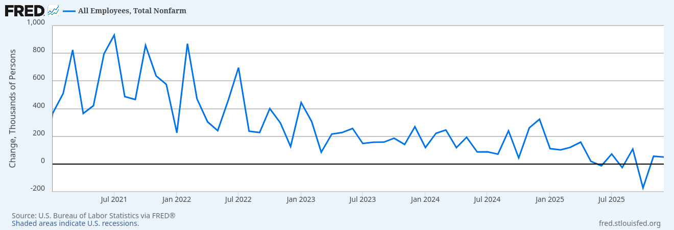
So far we’ve had about 160,000 jobs created over the last six months. That’s well below the number we need to absorb new entrants into the economy. The less reliable ADP number confirms the payroll data. The JOLTS data indicates a reasonable labor market and the first time climes show little job loss. This is where I think the first time claims may be under-reporting. If you lose your job, you might make slightly more money driving an Uber than collecting unemployment. I suspect other factors are depressing the actual number of people who would seek unemployment assistance. That’s not necessarily a bad thing, if you can make more money driving an Uber than collecting unemployment. You would be better off, even if you are grossly under-employed.
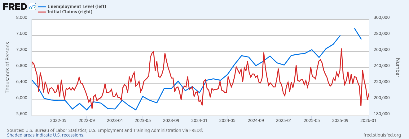
This is why there is no magic single number, and no magic single sample of that number, that gives you a picture of the US economy. From the numbers, the labor market looks slack but not recessionary. It seems to back up the anecdotes of job hugging (where employers and employees may want to part ways but decide it’s better not to part ways right now), and new entrants having a difficult time finding a job. If it’s true that 70 million Americans engage in some kind of “gig” work, that’s nearly half the labor force (about 160 million participants). And maybe a weak jobs number isn’t as bad as it sounds if people can enter the gig economy instead of a “regular” job, and those people are under-counted. (Setting aside issues of job security, benefits, and the impact of under-employment). Is the labor market indicating recession?
There is something we need to acknowledge. Deficit spending is stimulative. At the end of the 2008 recession, there was a push-back on yet another democrat taxing and spending. And the stimulative policies were tempered by the resistance from republicans. (Although at levels that now seem quaint). That drew out the recovery period because fiscal policy was not injected into the problem. Spending more money than the amount removed through taxation stimulates activity and we may have ratcheted that up with the latest budget. We won’t know the final numbers until 2027. It will depend on actual receipts and actual outlays. There is some evidence the outlays will be higher than anticipated, with the DOGE effort showing an actual increase in government spending. If income tax receipts are weaker than offsets from tariffs, it could easily come in above estimates.

The current CBO estimates put the 2026 estimated deficit at 5.5% of GDP. The percentage of GDP is useful because it allows us to gauge what the real impact of the deficit, given the size of the economy. After all, a billion dollar deficit is a much bigger issue if the economy is only 10 billion dollars in size. The 2026 number may be above (likely) or below (unlikely) estimates given factors we won’t know until later. We won’t know until we actually see the impact of the new tax law, along with actual real spending.
The deficit coming down slows the economy in kind of a natural way, as activity boosts tax revenues and broader employment lowers spending on programs like SNAP and unemployment insurance. This natural brake pulls money out of the economy in higher tax revenues and lower spending, reducing the risk of the expansion becoming inflationary. However, we are doing two things that are expansionary for 2026, which are reducing tax rates and pushing the Fed to lower rates. In the face of already expansionary fiscal policy, this may push inflation for 2026. Unfortunately, it’s almost impossible to know the actual impact on inflation because we don’t know how the economy will react. The consumer in the lower 50% of income is in shambles. Most of the consumption is done by the top 20%, with half concentrated in the top 10%. There may not be the purchasing power for broad inflation, even if high end goods may see a level of inflation.
In addition, lower imports from tariffs boosts GDP, even if it means people are consuming less stuff. Could we be in a world where stagnation is masked as the GDP “increases” due to fewer imports? It’s mathematically possible. You could have patchy inflation depending on what goods you are measuring along with an improving GDP due to fewer imports. (You aren’t better off, you just don’t buy that sweater or bottle of wine, because it’s a little pricey). Combine this with jobs numbers being a less reliable measure of economic health (because workers don’t leverage unemployment insurance and transition to gig work), and you could have a stagnant economy, even if the numbers don’t look bad. You have low unemployment because of gig work and GDP growth from lower imports, even though you are under employed and just can’t afford things you used to buy.
At the end of the day, the purpose of economics is to understand how these voluntary and sometimes emergent systems of interaction between people create well-being. The purpose of 2% inflation or a target of 4.5% unemployment isn’t because the number is important, but because the well-being of many people seems to change at around those inflection points. If inflation drops below 2%, that is usually because economic activity is slowing and over time we will be worse off. If it goes above 2%, that’s a level people feel it erodes their buying power and they are less well off. If unemployment is too low, there is inflation as wages are bid up, while if it is too high, people are out of work and can’t find jobs. The goal of the specific metric should be to indicate when a change in policy is necessary because people feel their well-being is falling.
But it feels like we’re too focused on the numbers, rather than what they mean. I can’t count how many times it feels like the number itself is the target or the policy is being gamed to meet the target number. This includes “patching up” numbers like the CPI so they under report inflation. (There is mixed evidence on this. But we would expect the CPI goods basket to change as the basket of goods and services from 1976 is less applicable in 2026). When the economy changes, the old metrics used to gauge the health of the economy no longer make sense. Following unemployment claims or number of jobs created, if people are shifting to gig work that isn’t reported through these numbers, may no longer provide a meaningful metric. And yet, we don’t have a widely accepted substitute. Like a quantum system isn’t in one state or another until it’s observed, our economy is both good and bad at the same time, because we lack the metrics to observe it.
