Just in time for me to point out the 2 year was stuck and that meant curves are likely flattening, it breaks out above its range. There is a big caveat to this. Just because it breaks out, does not mean a true break out. It’s going to need to close above the range and have at least one complete body outside the range before I’ll start to believe it’s a true breakout. It could just retreat today, leaving the wick, and maybe not be a breakout. Also, ranges should be thought of as regions. Just because I drew a line 1 pixel wide, does not mean it’s tick wide. It should be thought of as “around this area, sellers tend to show up.” If it exits the range, it means the sellers are not showing up and there is net buying.
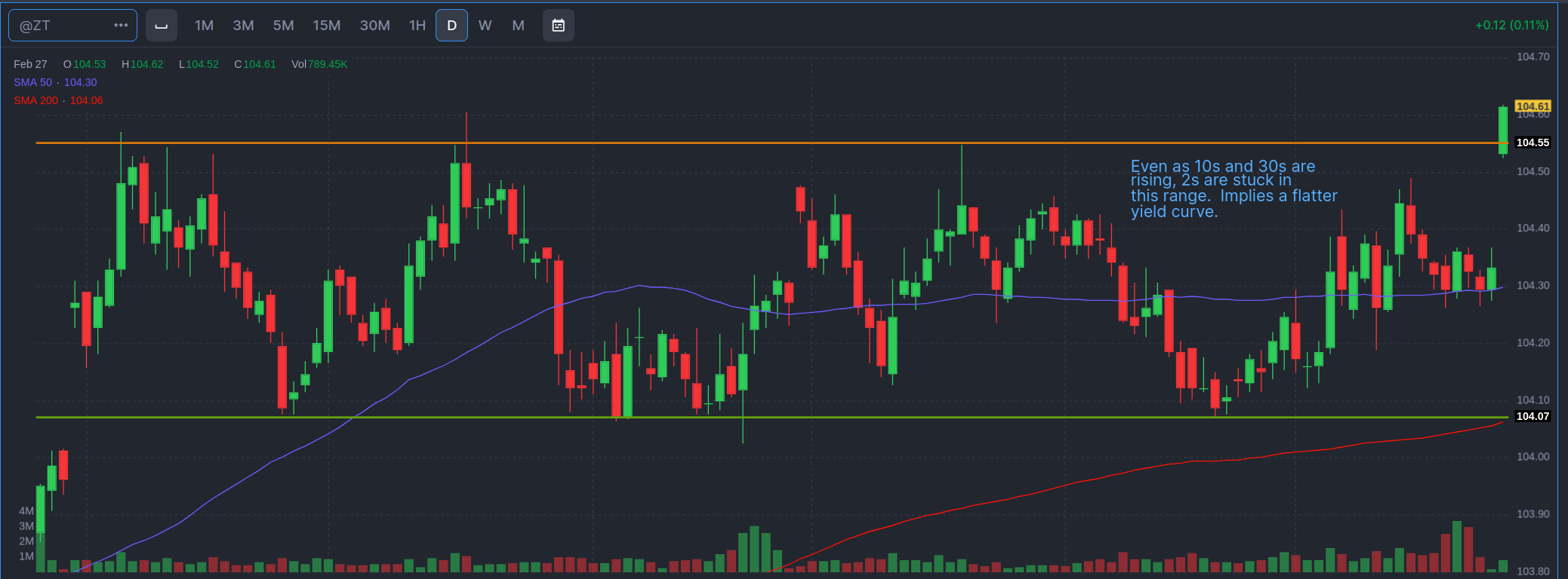
Looks like the two-year finally broke out of its range. At the same time the 10 year is popping. That keeps the yield curve in contago. Setting aside the gap up (which is kind of violent for the 2 year bond future). Maybe we expect the Fed to really inject more liquidity as the cockroaches come out? Dunno. The Fed has been active in the Repo markets, which usually means they’re adding liquidity.
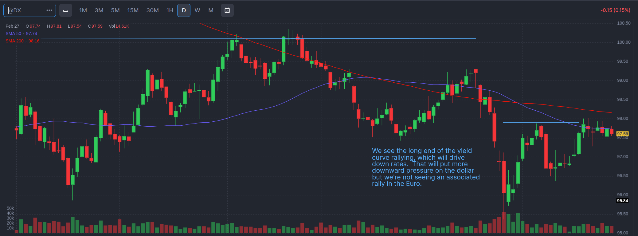
That keeps downward pressure on the dollar. That suggests the dollar will continue to erode. As the interest rates drop, it makes other bonds or investments, or just holding cash, more attractive. That reduces the demand for dollars, and therefore the dollar will fall against other currencies. The weird little resistance area was originally just a marker looking for a higher high, if the dollar is pulling up, because we got a higher low. However, this might be forming a wedge.
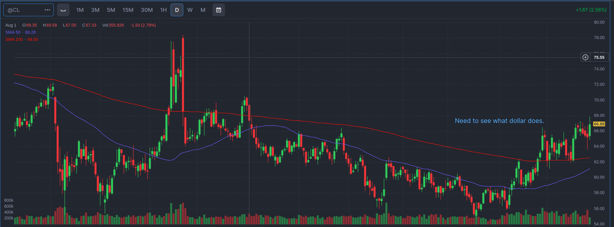
Which will continue to push up commodity prices, like oil, which will fuel inflation. Which will limit the Fed’s ability to bring down the Federal Funds rate. But it will impact peoples’ sense of affordability. It’s why you could go into recession, the dollar tanks, but commodities (like food and energy) get more expensive. Core inflation (those sneaky little devils always exclude food and energy), may drop, but what a consumer feels may not improve all that much.
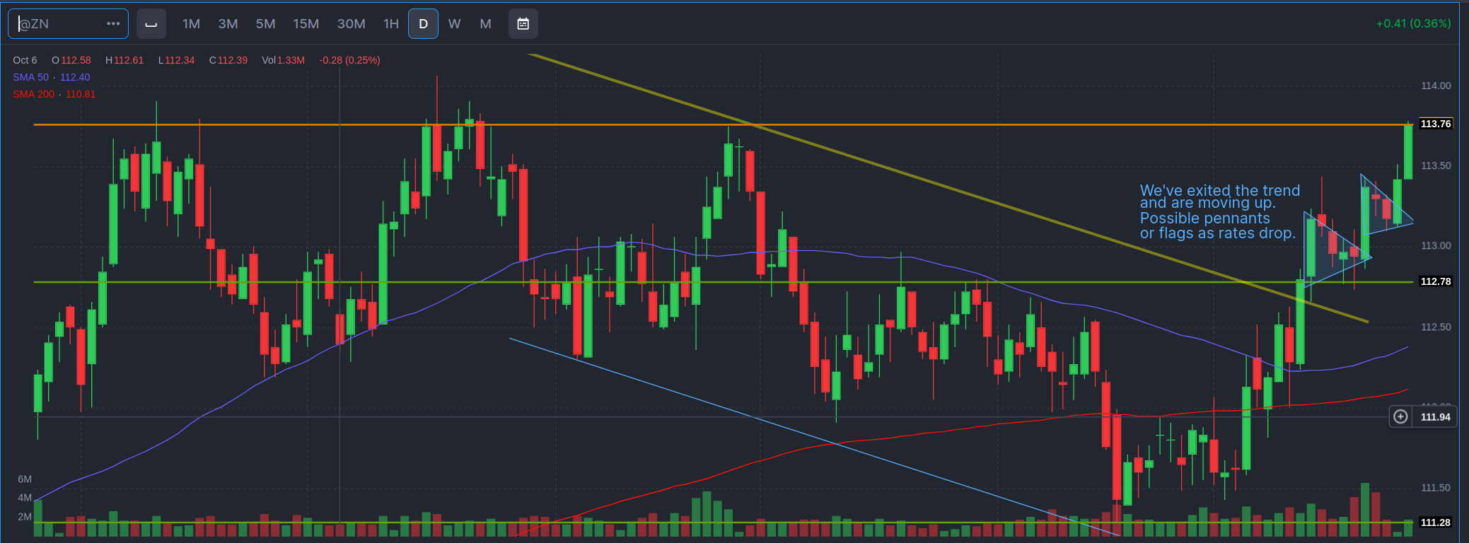
On the 10 year I identified two possible pennants. What do they mean? Does it mean the price will always go up because the pennant exists? No. The pennant is just a price pattern that tells me when sellers showed up to take profit, the buyers didn’t cave. They stepped in. That’s all. It tells me there’s buying energy there for the 10 year bond. And if I were to bet on a direction, it would be toward higher prices. But I don’t bet on it, because chart patterns are not a guarantee of future performance. They are also a Roschach test and subject to interpretation. You might only see the pennants because I pointed them out, not because you would have seen them. And I might be wrong. I might be misreading the price action. So I would never buy or sell based on a chart pattern.
This is not investing or investment advice to you, or anyone. It’s is provided for your entertainment purposes only. And if you are investing, contact a professional before making any decisions. Buying and selling stocks, futures, or any investment is a risky activity and can cause you to lose money, including the principal which you invest.
